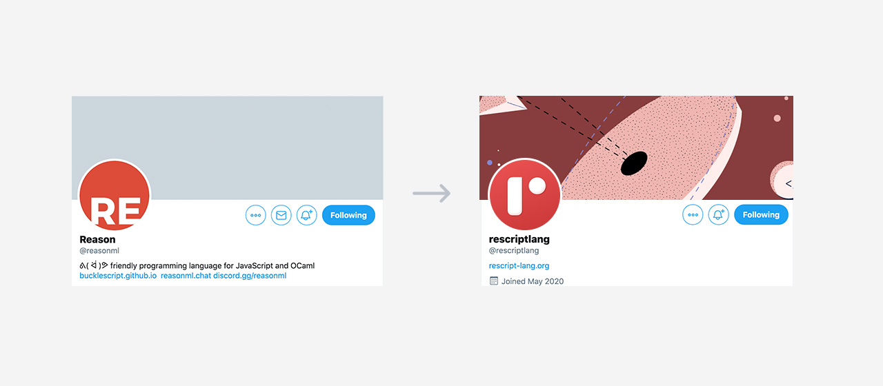
A New Logo for ReScript
Today, our resident designer Bettina is unveiling to us the fresh new ReScript branding we've been long waiting for. We hope you're as excited about the result as us!


Why the Rebranding?
ReScript is the evolution and fusion of Reason and BuckleScript. As we're a design-minded community, we'd like to convey this new identity not only through new technical changes as we've done so far, but also through a proper, more professionally crafted logo, color scheme and font. At the same time, we'd like to do so while recalling our roots.
Here it is!

The old Reason and BuckleScript logo had many limitations:
The icons didn't really work well on round Social Media profile images (or round shapes at all).
There's no guideline on how the logo works inverted, or on colored background.
The large red rectangle makes it difficult to balance the logo with other elements.
The buckle and belt were a bit too literal and did not convey much.
The new logo addresses all these and more:
Creating Meaning Through Simple Shapes
A minimal logo design is achieved by putting aside all distractions while focusing on legibility, meaning and small details like clear lines, interesting perspective and depth.
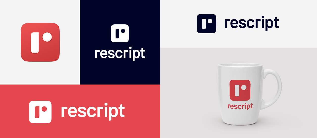
The letter "r", composed of two shapes, is inspired by Albers, a german-born American Bauhaus artist and typographer. An object should be simple, beautiful, functional and accessible for everyone - a statement which applies to ReScript's principles perfectly.
I/O: The rectangle and circle represent the input / output, recalling the digital nature of a program.
The red app-shaped background references the vibrant, playful applications our developers are empowered to create with ReScript.
The Logotype ("rescript") complements the brand mark with its clean look and its embrace of technology while retaining a functional look.
We'd like to position ReScript to be a community of product-first developers who care about the fit & finish of their work, while keeping an eye on the quality of their engineering. This interplay of design and engineering is a hard-to-achieve but beautifully worthwhile sweet spot that's frequently been missing in the programmer community; our vibrant logo is our renewed symbolic step toward this mission. Come along with us on our journey!
Next Steps
In the next few weeks, we will gradually roll out our new brand identity across our official communication platforms. We'll also provide marketing material and assets on our brand assets page for our users.
We hope you enjoyed our new design article. In the future, we're hoping to interleave our technical releases with a few design and UX-oriented posts. Stay tuned!
About the Designer / Creator
Bettina Steinbrecher is a freelance designer and brand consultant, specialising in digital products and brands, based in Vienna. Previously she has been a Digital Designer and later on Head of Brand Design at Adidas Runtastic, where she led major design efforts in the visual brand developing processes before and during the Runtastic / Adidas acquisition. She is now working as a freelance designer.
She has been involved in our design processes since the inception of the ReScript Association in 2018, and was responsible for all the user-facing websites such as reasonml.org (now rescript-lang.org) and rescript-association.org. She also created the new logo of the OCaml Software Foundation.
